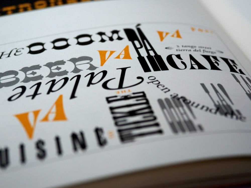
Typography posters are unique and creative ways for you to communicate textual information to your target audiences. This type of poster is more dynamic, aesthetically pleasing, and eye-catching than typical posters when you do it right. The type of fonts, typefaces, alignments, colours will all play a huge role in creating a great typography poster. This article will talk about all of the tips you will need to have a great typography poster design along with what typography is and the reasons why it is important.
What is Typography?
Typography is the art of arranging text and letters in a particular way which allows the copy to be clear, legible, and visually appealing to the reader.
The art of typography focuses on font styles, appearances, and structures that aim to evoke specific emotions and convey certain messages to audiences. Typography focuses on bringing the text to life.
Having great typography allows you to establish a strong visual hierarchy, provide a graphic balance, and set the overall tone of your branding.
Typography should guide and inform audiences, optimise accessibility and readability, and ensure an excellent user experience for everyone.
3 Reasons Why Typography is Important
1. Typography allows you to build brand recognition
Not only will great typography on your posters enhance the personality of your company, but your target audience will also subliminally begin to associate the typeface featured on your poster with your brand.
Choosing consistent and unique typography that is aligned with your brand identity will help you establish a strong following and will help consumers to easily remember your brand when they see specific typefaces.
2. Typography lets you influence the decision making process of audiences
Typography on your poster can have a profound effect on the way audiences digest and perceive the information that is being conveyed by the text.
Fonts that are eye-catching and aesthetically-pleasing are much more persuasive than fonts that do not reinforce the message of the text or fonts that are not aligned with your brand’s identity.
3. You can hold the attention of audiences through typography
Great typography could be the difference between someone actually focusing on the information on your poster or someone passing by it without reading anything.
It is important that your poster is also visually stimulating and memorable, and that the typography you choose will play a significant role in this process.
Related: 6 Rules for Great Poster Layout

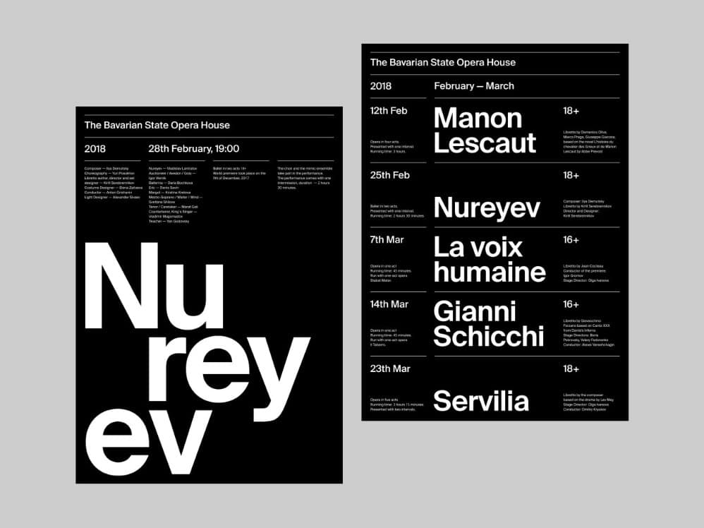
7 Tips for Great Typography Poster Design
1. Align your typography with the information and content of your poster

A lot of graphic designers will often want to avoid certain fonts that are overused or use special fonts that they think will make your poster unique. However, it is important to remember to align your fonts with the content of your typography poster.
This means that in certain cases, it may be better to use a more common font than a font that will not be able to get the right tone or mood across based on the information you want to communicate.
There is nothing wrong with using common fonts like Helvetica or Times New Roman if the content of your typography poster is catered towards a more general audience and your goal is to inform them.
2. Know when to use serif or sans serif fonts
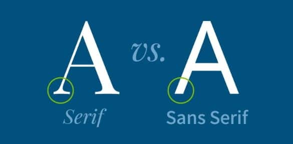
There are two major typefaces that all fonts fall under: serifs and sans serifs. You should be able to distinguish one from the other and know when you should use either of them for your typography poster.
Serif fonts have serifs, which are extra strokes on the ends of their letterforms. These fonts evoke feelings of honesty, tradition, integrity, and history. They offer a more conventional and traditional look.
Sans serif fonts do not have serifs on the ends of their letterforms. They are considered more minimalist, modern, and more legible. These fonts have a cleaner and more orderly appearance.
3. Avoid using more than three different kinds of fonts
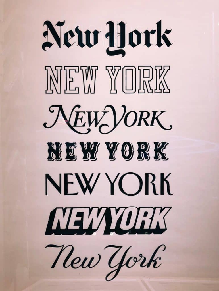
For your typography poster to be visually interesting and easily readable for everyone, it needs to be clear. Try to avoid using more than three fonts in the same poster as using too many may baffle and confuse readers.
Remember to use fonts that are aligned with what you are trying to communicate. Have a good reason for choosing specific fonts over others.
If you want to use several simple fonts, you should also avoid using too many colours as this can distract readers from focusing on what your content and message is.
4. Make sure that your fonts have the proper kerning
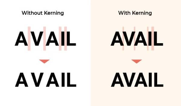
When selecting what typefaces you can use for your typography poster, you should also consider the space within the lines of writing and the space between the letters which is known as kerning. This will determine if your text will be easily readable from farther distances.
In case you have too much white space between letters, it will be hard for them to understand the flow of text. However, if your typography poster has too few white spaces, readers will find your text to be too crowded and too overwhelming to read.
5. Take note of all of the adjustments you have to make for all of the texts
Lining up and adjusting important details is one of the most important for your typography poster. You do not have to adjust each line of text, but you will need to line up important details and pieces of information to make them stand out.
To make sure that everything is aligned and adjusted, graphic designers can utilise a baseline framework. This will be especially useful when designing your poster and properly placing all of its elements.
Related: Freelance Graphic Designers in Singapore
6. Utilise repetition to establish a visual hierarchy
When you establish an organised process of adjusting all of the details on your typography poster, you can now utilise the idea of repetition to help you establish a consistent visual hierarchy.
You can achieve this by making sure that every textual detail is operated identically in all situations. If you are using 30 bold Arial for one subtitle, you should use this for every one of your subtitles in the poster.
Practising this habit during poster designing will make sure that readers can get visual bonds and easily read the message that you are striving to send through your posters.
7. Focus on making your information eye-catching and easy to read
All of your graphic design and typography choices won’t matter if your typography poster doesn’t stand out or cannot be easily read from a distance.
Your typography choice should be able to grab the attention of anyone that is walking or driving along your poster even from far distances and the poster’s content should be engaging enough for them to read it completely.
Remember to make sure that your poster fonts are large enough that the key information can be easily taken in without readers having to get too close to the poster.
It is recommended that vital text on your poster should be legible from about five feet away so that you can communicate your message to as many people as possible without having them come all the way in front of your typography poster to read it.
Knowing all of these tips before starting your typography poster is great, and what will be even more helpful for your design process is working with professional graphic designers who are experienced in creating great posters. This is when our team at VideoBlast can help you out.
Our team of graphic designers at VideoBlast offer high-quality graphic design services that include unlimited requests and revisions at affordable rates. You can learn more about our services by contacting us now.
Related articles: