When the main product that you are selling is food, it is important that you choose the right advertising materials which are effective in emphasising how good your food tastes and looks. Food posters are an impactful and cost-effective advertising option because they are affordable and can help you create a lasting impression on your target audience. When it comes to creating food posters, you should treat them completely differently compared to posters that communicate other promotions like events or products. This article will talk about the 8 tips that will help you improve your food poster design.
8 Tips to Improve Your Food Poster Design
1. Carefully go over all of your choices for the locations of your poster
Putting up your poster in a random location without any thought will waste all of your effort, time, and budget. You should carefully go over where your posters will be located so that you can make sure it can be appropriate and effective in that specific area.
You will need to gather all of the information when choosing a location. This means knowing what specific building, room, office, and even down to which side of the area you will occupy. Knowing what colour is used behind your poster is also crucial for its design.
Once you know everything about where your food poster will be located, it will be much easier for you to know what type of designs, colours, fonts, and images to use to stand out and grab attention in that location.
2. Make use of colours to elicit a specific mood
Whatever theme you want to use for your food poster, whether it’s to promote a restaurant or a specific food product, using colours helps you convey a more effective message for your target audience.
Colours can help you elicit a specific mood, grab attention, and generate different types of emotions. It is crucial for you to know that there are certain colours and hues that stimulate appetite.
Here are four of the most common colours that can be used on food posters:
- Red – Red is a fiery colour that pumps up the blood and makes the feeling of hunger more prevalent.
- Orange – Orange is the colour of citrus fruits as well as carrots, this hue also stirs up the sensation of hunger.
- Yellow – Yellow elicits cheer and most people will be more likely to have a good appetite when they are feeling happy.
- Green – Green is the colour of a lot of vegetables and salads so it reflects a feeling of being healthy.
3. Play around with different fonts
While clean and simple fonts are great to use, you should also try to experiment with different fonts that can align visually with the theme of your poster while still being able to communicate your information clearly.
You can also try out different colours for your fonts as long as you have chosen the right set of fonts already. Make sure the font colours fit well with your theme and can be read clearly, especially from farther distances where most people will read your poster.
Using several fonts is crucial and it can create a bigger impact to each font than just using one all throughout the different parts of your poster. The important thing to remember is to not overdo it and not make the fonts look disconnected from your visual theme.
Related: 6 Rules for Great Poster Layout
Take your food posters to the next level!
4. Be clear and concise with the information you will include
Some poster designers may think that putting all the information that you can on a poster is a must, but this is not the case. Cramming too much text in your food posters can overwhelm or bore people which prevents them from reading further.
Try to be clear and concise with the information you want to communicate to them so that you do not confuse and overwhelm your target audience. Remember to keep your objectives in mind when thinking about what information to include.
Only highlight all the necessary text that lets audiences know what they need to do. This could be visiting your restaurant to eat or going to their nearest store to purchase your food product.
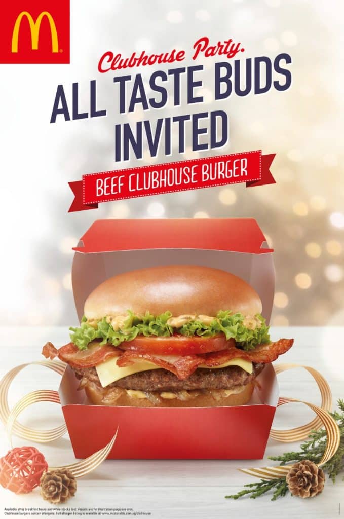
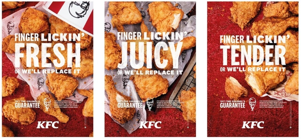
5. Use high-quality and clear photos for your food poster
Probably the most effective way for you to market the food you are selling is by using actual pictures of your food. You should use high-quality and clear photos from professional photographers so that they will look great on all of your marketing materials.
When people see a high-quality food photo, it stimulates their appetite and that will make them come to your restaurant or order your food. Using clear photos allows consumers to easily picture themselves enjoying your food.
While you should do your best to make your food photos appealing and appetising, you should also keep in mind to make it an authentic representation of what consumers will order. They may feel deceived if the photo on your food poster doesn’t match with what they ordered at your restaurant or store.
6. Add creative illustrations and graphics to visually enhance your food poster
Usually, just using photos will not be enough to attract the attention of your target audience. You will also need to add creative illustrations and graphics to visually enhance your food poster.
Illustrations and graphics can help you with informing, persuading, and influencing consumers in ways that photos may not be able to. Make sure that you work with a professional graphic designer to help you out with the illustrations and graphics.
You will have so much more creative possibilities when you are able to properly incorporate your photos with graphics as they can complement each other and make each other stand out even more.
If you are looking for graphic designers to help you with your food posters, then our team at VideoBlast can help you out. We offer unlimited requests and revisions for our graphic design services at affordable rates.
7. Include offers and discounts
Creating offers and discounts and also including them in your food posters is another effective way for you to grab people’s attention. Your offers and discounts should be based on what your target audience would want.
For example, if you are a restaurant that is located near a corporate office, you can offer larger discounts during lunch hours. These offers can push apprehensive consumers to finally visit your restaurant and try out your food.
8. Always remember to incorporate a call-to-action prompt
The main purpose of having a food poster is for people to take action once they see your messaging and what you have to offer. You should motivate your viewers to interact with your brand in a way that achieves your marketing goals and objectives.
You should be clear with your call-to-action prompt so that the average consumers can easily understand what you want them to do. This could be visiting your store or restaurant, or ordering your food online.
Remember to include your address if you want them to visit you and include your website if you want them to order online so that everyone can easily remember where to go when they want to take the next step with your brand.
When you get to follow these tips and work with a professional graphic designer who can help you achieve everything that you want visually, you will have the best food poster design that can achieve all of your goals.
Related articles: