One of the most important design elements that you should carefully think about is the logo. A bad logo can make it difficult for you to stand out while a great logo can elevate your brand and make yourself more memorable. If you want a logo design that can create a strong impression, you should make one that is simple. With simple logos, you will have a much better opportunity to immediately impress consumers. This article will talk about 7 best simple logos which create a strong impression from the most successful companies.
7 Best Simple Logos That Create a Strong Impression
1. Google

Google’s current logo has been used since 2015. At first glance, their logo may just look like a colourful spectacle without any thought. However, since they chose a wordmark for their logo, the use of colour is important.
They aimed to use primary colours which are red, blue, and yellow to give their logo a look that pops. They also subverted expectations by including a secondary colour, green, as a way of saying that they don’t have to follow the rules which shows their sense of innovation.
2. Coca-Cola
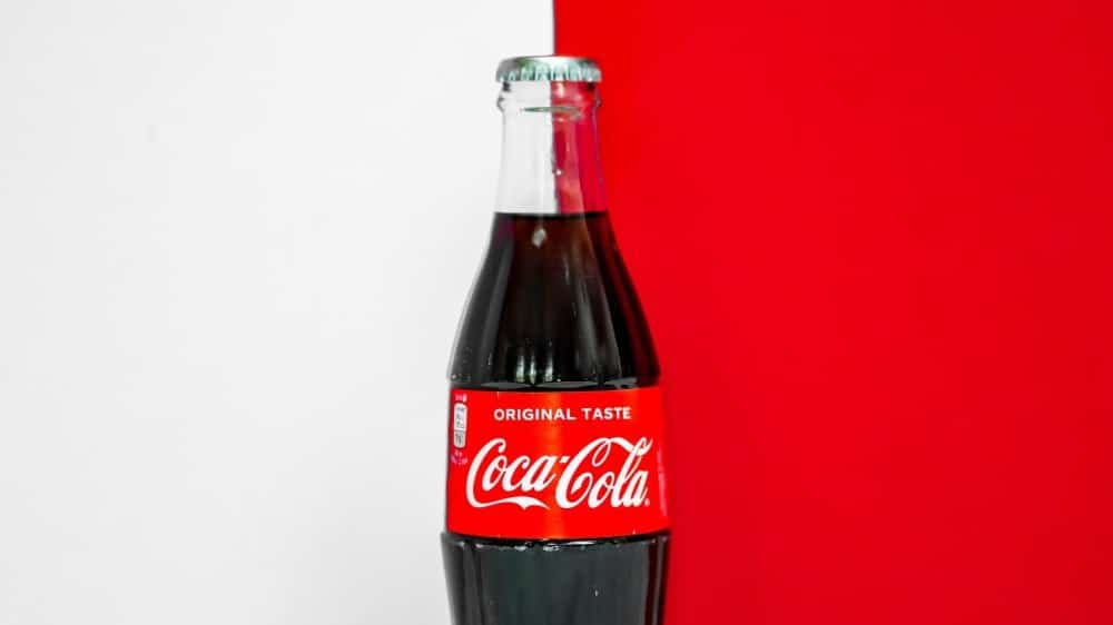
Coca-Cola’s logo design is a great reflection of classic Americana. When we think of classic America, we can immediately associate it with Coca-Cola’s logo which includes cursive and fashionable lettering.
Also, their use of the colour red is perfect for their brand and product as it evokes energy, excitement, and passion. You always think of the colour red when you think about Coca-Cola.
This simple logo gives them both a nostalgic and cross-generational appeal which is why it can still create a strong impression after all this time.
3. Nike
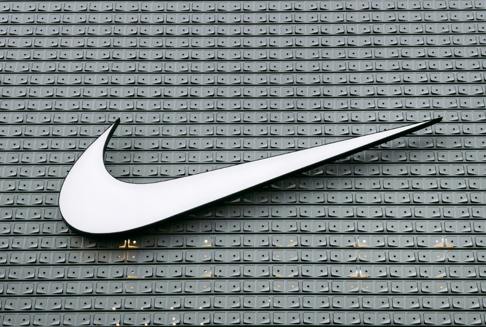
One of the most perfect examples of simplicity, Nike’s simple logo, the “Swoosh” is one of the most recognizable logos around the world and it doesn’t even include the company’s name.
Based on the goddess of victory, the swoosh mimics the wing of the goddess combined with Nike’s own specific brand traits. It represents motion and speed which is what Nike wants you to feel while wearing its products.
This innovative logo design represents these traits and more in a simple, creative, and effective way.
4. Twitter
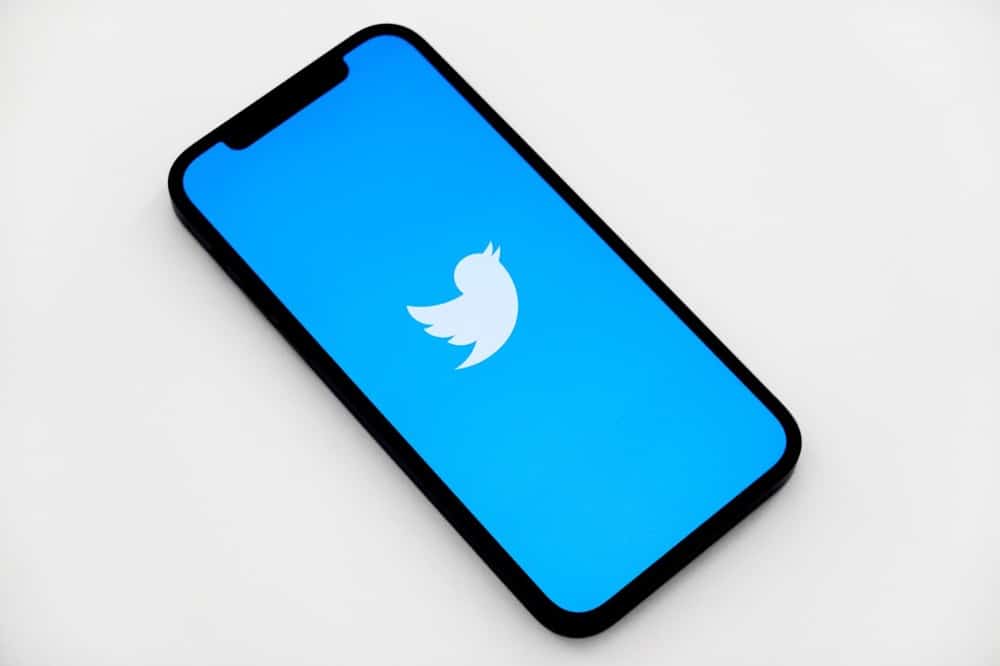
Twitter’s main selling point as a platform is that it can be used to facilitate several and short communications similar to how a bird tweets. So it is fitting that the logo fits both its essence and its brand name.
Their logo is just a simple and cute little bird and can be easily recognized and noticed even without its brand name attached to it.
This is one of the most creative logos because of how subtle the visual elements are and how much of its brand essence can be immediately understood just by looking at it.
Ready to stand out from the crowd? Get access to our premium custom visual content now!
5. Apple
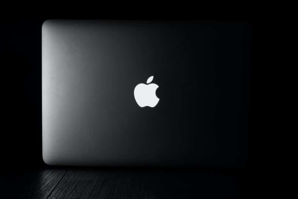
Apple’s logo is one of the best and most significant logos in the world because of how simple and memorable it is across its history.
Since Apple always tried to create products that are sleek and sophisticated, their logo is actually a good representation of that. It completely matches the personality of their brand.
When we think of Apple, we think of attributes like intelligent, sleek, and minimalist. The logo conveys all of these and more.
6. McDonald’s

The logo of McDonald’s, which is called the Golden Arches, immediately grabs your attention wherever you are in the world. If you are going through a town, mall, or airport and see those arches, you know what they mean.
McDonald’s uses a simple logo with bright red and yellow colours which are great at grabbing the attention of people and makes it more memorable.
Also, the unique curve of the letter M that they use is another factor which makes their simple logo stand out from other logos since you usually don’t see them being used by other companies.
7. Microsoft
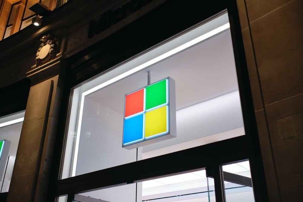
Unveiled in 2012, Microsoft’s most recent logo redesign is a more simplified and minimalist take on their previous logos. There are two important parts in the logo which are the squares and the wordmark.
The squares used in the most recent logo are now flat and these four different colored squares each represent different Microsoft offerings. Blue is for Windows, red is for Office, yellow is for Bing, and green is for Xbox.
For the wordmark, they stayed true to their branding and also used the Segoe font which is the same font that they use across all Microsoft software.
5 Benefits of a Simple Logo
1. A simple logo is easy to recognise.
One of the most important reasons why you should opt for a simple logo is because it can be very recognizable at just a glance.
With a simple logo, you will be able to bring your own brand to mind within just a fraction of a second. The quicker people remember your logo, the better.
The subconscious mind of a consumer should be able to recognise your logo as familiar long before their conscious mind has time to examine what it actually is.
2. Your brand will become more memorable.
When it comes to creating logos, the simpler ones are always the more memorable ones. When designing a logo, you should immediately make the consumer associate it with your product or service.
A simple logo has a better chance of standing the test of time as evidenced by most of the examples that we have discussed above.
If you end up creating a logo that is not memorable, it might actually end up doing more harm than good. That’s why it is crucial that you get the help of professionals to make sure your simple logo looks great.
3. Simple logos are more aesthetically appealing to consumers.
A logo for your company should be visually appealing. An attractive logo creates an appreciation of your brand and typically, simple designs are the most pleasing and beautiful to see.
Including too many design elements or colours into your logo may just distract or even annoy consumers when they look at it. This feeling of annoyance could extend towards your brand itself just by association.
Focus on creating a logo that is simple so that it provides an aesthetic appeal that most people will love to see and is easy on the eye.
4. Using simple logos makes it easier for consumers to recall your brand.
What makes simple logos so effective is that it requires less cognitive processing compared to logos that may have more complicated and complex designs.
Trying to process large amounts of information exhausts our brains. Consumers don’t want to just stare at a logo and think of it as a puzzle that they have to figure out to understand.
A simple logo provides exactly what our brain craves which is brief, succinct, and clear data that we can easily process and recall.
5. Your message will be a lot clearer when you use a simple logo.
Your logo should be able to communicate a clear message of who you are and what you offer to consumers. An effective logo should be able to present your brand as your logo and brand should be inseparable.
This is why it is crucial to have a simple yet targeted logo. When people see your logo, they should immediately have an idea of your brand and message.
When they have all the information that they need when they see your logo, they will have a complete emotional reaction. This is the crucial moment where they make a decision about what they think of you.
If you need any help creating a simple logo that creates a strong impression for your business like the ones we talked about, then our team at VideoBlast can definitely help you out.
With VideoBlast, you will work with a team of professional graphic designers who can create great logos and other design elements to make sure your brand creates a strong impression.
Related articles:
- 6 Rules for Great Poster Layout
- Slide Design in Singapore: A Simple Guide
- Best Poster Design in Singapore: 6 Tips to Design Great Posters
Ready to stand out from the crowd? Get access to our premium custom visual content now!