If you’re looking for tips on namecard design that is both professional and representative of your company, you’ve come to the right place. In this blog post, we will discuss some of the best ways to create a memorable and effective namecard design for your business in Singapore.
We’ll go over important factors such as choosing the right typeface, using colors effectively, and designing for different industries. So whether you’re just starting out with your business cards or want to revamp your old designs, read on for some helpful advice!
FONT in namecard design
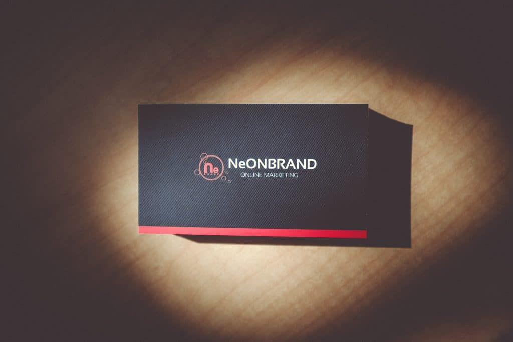
When it comes to namecard design, first impressions are everything. So you want to make sure that your card design is eye-catching and memorable. One way to do this is by choosing an interesting or unique typeface for your text.
This will help your name card stand out from the rest and give people a sense of what your brand is all about. However, don’t go overboard with the fancy fonts–stick to one or two at most so that your card remains legible and easy to read.
Minimalist design looks great on your business cards, however, what impact is it when your clients cannot read the content? It is essential to prioritize comprehension over creativity. This is particularly true for fonts. Ensure that you have a readable font size. In addition to the font, other elements like lines and colors can also affect the printing of your name cards.
Take note of the following points:
- Choose a case for your font with different weights to aid in the hierarchy of information: Condensed, Light, Regular, Semibold, Bold.
- Make sure that the font size is at least 6pts or bigger.
- Maintain clean lines to a minimum of 0.25 pt.
COLORS in namecard design
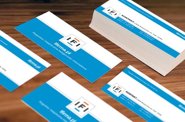
In addition to choosing an appropriate typeface, using colors effectively is another key element of namecard design. Colors can convey a lot about your brand, so it’s important to choose wisely.
If you’re designing for a corporate client, you’ll probably want to use more subdued colors like black, gray, and navy blue on your namecard design. On the other hand, if you’re targeting a younger audience, brighter colors might be more appropriate. Just make sure that the colors you choose complement each other and reflect the overall tone of your brand.
Unlock Your Business’s Potential. Check our full list of services!
INFORMATION in namecard design
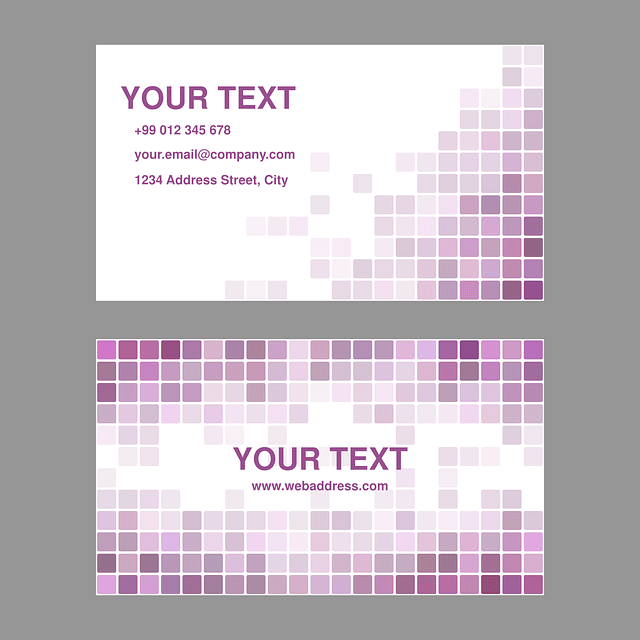
Don’t clutter your card. Less is more. Include the essential information such as name, title, business telephone number(s), email address, and website. It is important to be careful not to overload your text within a limited space. It could be a turn-off for some people and challenging to understand.
BLEEDS in namecard design
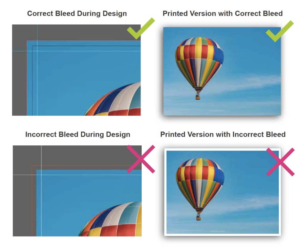
Image Source: PrintingCenterUSA
The bleed refers to an extra part of the artwork that allows printers to have a little area to conceal the imperfections of printing. It’s difficult to print up to the border of the card, and this is why bleeding is required to leave some margin of error once trimming takes place.
Set a bleed around 3mm away from the edge of your namecard design. Do not place your content too close to the edges of your card. You don’t want to cut some important information from your namecard.
CONCEPT of namecard design
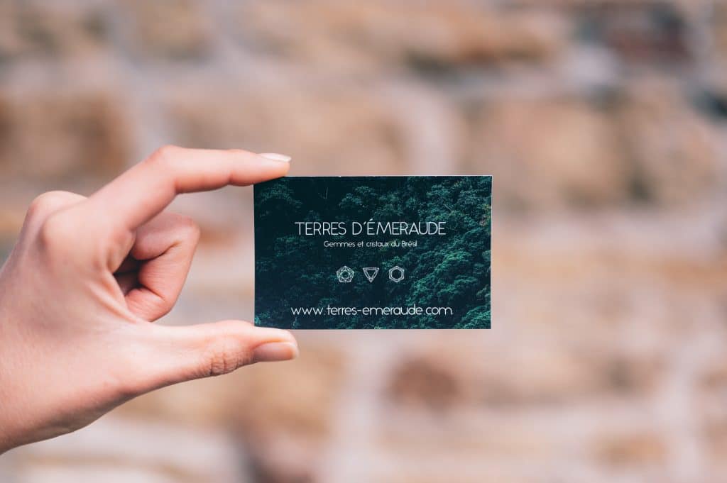
Finally, it’s important to keep in mind the industry you’re designing for when creating name cards. For example, if you’re in the hospitality industry, your card might benefit from including a photo or image related to your business. Or if you’re in the creative field, you might want to use more unique namecard design elements. No matter what industry you’re in, there are endless possibilities for creative and effective name card design–it just takes a little bit of imagination!
We hope these tips have given you some inspiration for your own namecard designs. Remember to keep the overall tone of your brand in mind, choose an appropriate typeface, and use colors effectively to create a namecard design that is both professional and representative of your company. With a little bit of creativity, you can design a name card that is sure to make a lasting impression.