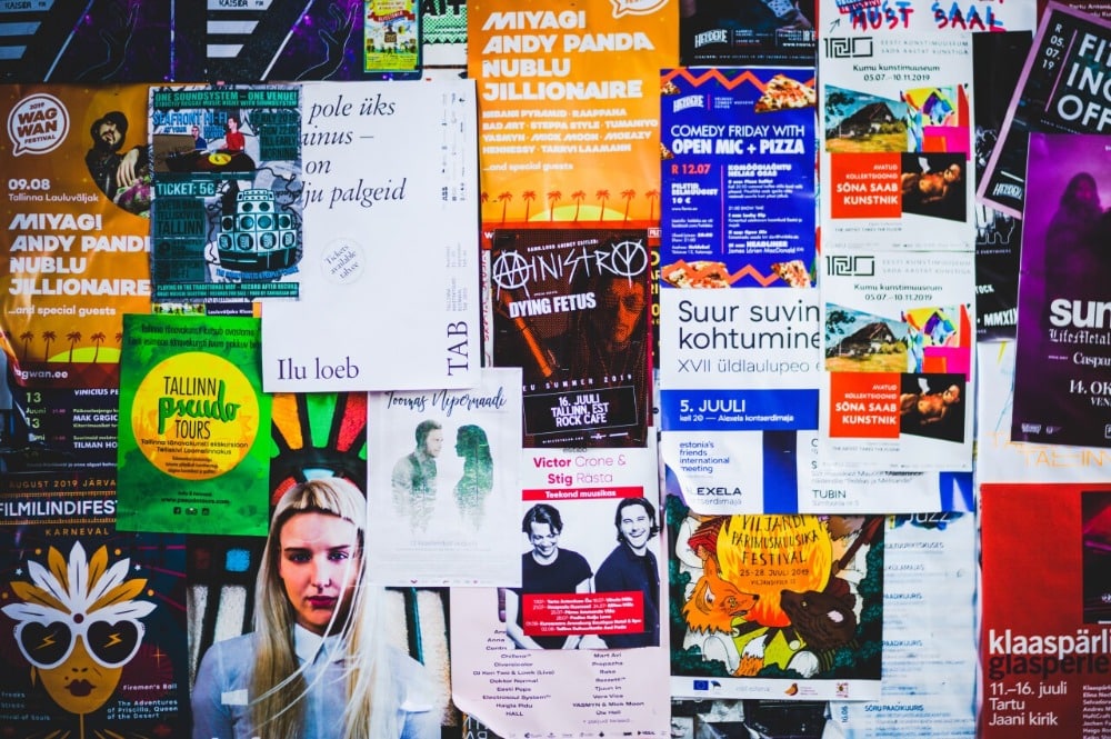
Event posters are usually the first and one of the most important advertising materials that are created for an event. Event posters can be highly effective for publicising and marketing an occasion, whether you are holding a blowout sale, festival, concert, or fundraiser. However, to make sure they have a real and significant impact on audiences, they have to be well-designed. There are different elements and factors you need to consider when designing an event poster. This article will cover all of the tips you need to improve your event poster design as well as the important event poster elements.

4 Event Poster Elements to Consider Before Getting Started
1. The goals of your event poster
The first thing you have to figure out before getting to the design stage is the goal of your event poster. You have to establish this early on so that the design of your poster will be focused and consistent to what you want to achieve.
When you have goals for your poster, it will also be a lot easier for you to determine the success of your event poster. For example, if the goal of your event poster is to increase ticket sales, this is something you can track to monitor if your poster is effective.
Monitoring the success of your event poster will be even more important if it is part of a larger advertising campaign. This lets you know how audiences responded to your poster and how you can improve them in the future.
2. The target audience for your event poster
Along with your goals, you should establish the type of audience you want to target with your event poster. Different audiences have their own specific likes and wants which you have to cater for with your design.
Each audience will react to specific media differently which makes it important to identify your audience accurately. Placing yourself in the customer’s shoes is important so you can get a sense of what type of designs, colours, images, and graphics they prefer.
3. The key Information you want to include
Another element you have to plan in advance before designing your poster is the key information that is absolutely necessary to include in your event poster.
Think about what your target audience needs to know in order to attend and participate in your event. Certain information should always be included regardless of the event type or scale like the date, time, location, and website.
Other details that you can consider adding in your event poster can be the cost or entrance fee, discount information, dress code, age restrictions, or whether food and drinks will be served in the event.
4. What poster size you want to use
Event posters can come in many different sizes, and the best size for your event poster will depend on where you plan to post it or upload it online.
If you want to have a poster that viewers can read from a great distance, you should create a larger poster and adapt the scale of all of your design elements.
These are the most common poster sizes to use and their suggested applications:
- Mini poster or flyer (8.5 x 11 inches) – These posters can easily be printed at home and are commonly used for street advertising and on community bulletin boards.
- Small poster (11 x 17 inches) – This poster size is equivalent to two sheets of regular paper. These can also be used on bulletin boards, walls, doors, or other areas where viewers will be seeing it from short distances.
- Medium poster (18 x 24 inches) – This size is usually the largest one that is used for indoor advertising so viewers will not be overwhelmed when they see it in a small space.
- Large poster (24 x 36 inches) – Large posters are typically used for outdoor advertising as this size makes your details large enough to be readable from a distance.
- One sheet poster (27 x 40 inches) – This size is often used for large-scale and high-impact marketing for both indoors and outdoors. This can be in music venues, bus stops, movie theatres, and train stations.

Make Your Mark with Professional Graphics
6 Tips to Improve Your Event Poster Design
1. Generate a concept for your event poster
Event posters encourage a lot of creativity when it comes to creating its design. This is because the whole point of a poster is to grab and hold the attention of viewers.
If you try to do something too clever or complex, you might confuse your audience. However, staying safe is not a great idea either since that means you won’t stand out. Generating a strong concept for your event poster will guarantee you attentive and curious readers.
It is important that you discuss and go over certain concepts with your team. This is to make sure that your concept can be easily understandable by different types of readers.
2. Identify what type of aesthetic you want to use
Once you have chosen a concept, you have to present it visually. This means you will have to identify what type of aesthetic you want to use which can properly communicate your event poster’s concept.
Committing to an aesthetic style gives your project direction and helps you narrow down the creative possibilities for the event poster. Your aesthetic should match your event and what your viewers would like to see.
If you are creating a fundraiser for an art gallery, you can use a minimalist style. However, if you are promoting a gaming event, a cyberpunk or a neon aesthetic may be more appealing.
Using elements, colours, and illustration styles that are familiar to your target viewers can help send them an instant message about what they can expect from your event.
3. Establish a focal point for your event poster
A lot of event posters will include text and a specific visual element. However, there are event posters that only have one or the other.
What is important when designing your event posters is that you are able to decide which element you want to be your main focal point. This allows you to let your readers immediately focus on one part of your poster as well as establish a visual hierarchy.
When you establish a focal point in your poster, you are able to make sure that readers will consume the event poster in the order that you intended when creating it.
For example, if you want to showcase something visually in the poster, put a photograph right in the centre. However, if you want to focus on communicating details, place more emphasis on the poster’s text.
4. Use specific colours to grab the attention of audiences
Once you have established a concept, aesthetic, and focal point for your poster, now is the time to get more creative by implementing what specific colours you will want to use.
You have to be particular with your chosen colours because they are what will help you grab the attention of audiences. Some colours like red, orange, and yellow are proven to be more eye-catching than others because of how bright they are.
However, your choice should always depend on what theme and aesthetic you have chosen. You can also choose pink, purple, and blue for a futuristic theme or go simple with black, grey, and white for a more minimalist look.
Figure out what would work best for your theme and for your brand. If you want to play it safe, you can rely on your company’s colour palette.
5. Choose your fonts wisely
The typography of your event poster is another feature that you should keep an eye on. Having the right fonts is important as this will be what every reader will try to read when they see your poster.
Most successful event posters will have the title of the event in a large, eye-catching, and easily readable font and will have the details listed down in a smaller font.
Choosing which fonts to use together may seem like a difficult task, but there are simple guidelines that can be followed when it comes to pairing fonts.
6. Create anticipation with a series of similar event posters under one theme
If you want to create a lasting buzz before your event, you can create anticipation for it with a series of posters that follow a consistent theme.
This strategy is effective at building hype around a specific event or show and allows you to generate excitement for a longer period of time. To create a series of posters, your event posters will need to follow a consistent theme and design.
You will only have to change a few details and keywords to build anticipation as your event date gets nearer so that readers can instantly tell that all of your posters are recognisably cohesive.
Once you get familiar with all of the important elements and all the tips you need to create a successful one, you will be on the right track to creating your own successful event poster.
To make sure you get the best looking event poster for your company, you will need the help of graphic designers. When you work with VideoBlast, you get to collaborate with a team of experienced graphic designers who know everything about creating great event posters.
Our graphic design services include unlimited requests and revisions at affordable rates. You can learn more about our services by contacting us now.
Related articles: