Graphic design horrors are every designer’s nightmare, but did you know you could avoid them if you knew why they failed?
Let’s discuss some graphic design horrors and how you can avoid them.
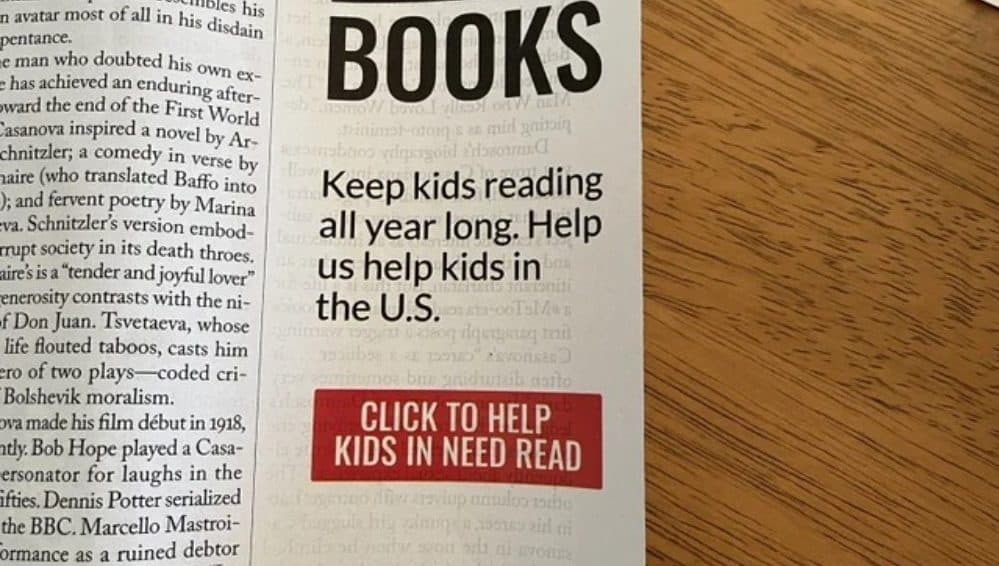
Designing For the Wrong Medium
Every designer needs to know where their designs will go. If you don’t know where your design will appear, something like this could happen, where the designer decided to add a clickable link on a newspaper copy. While this isn’t that horrific, it would still ruin your credibility, especially if it gets paired with the wrong color palette and has its colors translated wrong.
Did you know that if you need a printed design, you have to use CMYK colors? Similarly, you’ll need RGB colors if you’re using the design on a screen. You’ll come up with different colors if you try to use a color palette for an unintended purpose.
Using the Wrong Format
Have you ever wondered why some images turn blurry while others remain the same when altered? This is where the proper format and resolution come into play. Generally, it’s better to create designs in a higher resolution because you can always increase it but never reduce it.
Likewise, minding whether you need raster or vector images should always be your priority. You can scale raster images and expect them to keep their shape, but vector images tend to be less flexible when scaled or altered too much. If you don’t have the proper format, your design could end up blurry or stretched out and awkward like this.
Besides formats, consider image types as well. PNG images are best when you’re editing or wish to keep your designs in a high-quality format, while JPEG files are great if you want smaller file sizes, and GIFs allow animation yet maintain a small file size.

Overcrowding and Overusing Layers
Sometimes, you just want so many good things that you decide to put them all in one photo. This results in a confusing mish-mash of designs or ideas and usually doesn’t end well. Readers would have no idea what you’re talking about or clue about what you wanted to portray in the first place. Other times, you may just be in too much of a rush to polish your layers, like the picture below.
Luckily, you can easily avoid this graphic design horror by ensuring you don’t overcrowd your design and using appropriate layering and layer effects, especially if you’re using Photoshop or Illustrator. Think about your main goal and brainstorm some ideas to get your point across as straightforwardly as possible without needing to use too many elements.

Neglecting Negative Space
That white space on your screen isn’t useless, and you should definitely not attempt to cover it up. White or negative space is good. It allows your audience to better process your message and can even lead them where you want them to focus. So, whatever you do, don’t do something like this just to fill the space. That’s not the worst of the graphic design horrors out there, but it is an example.
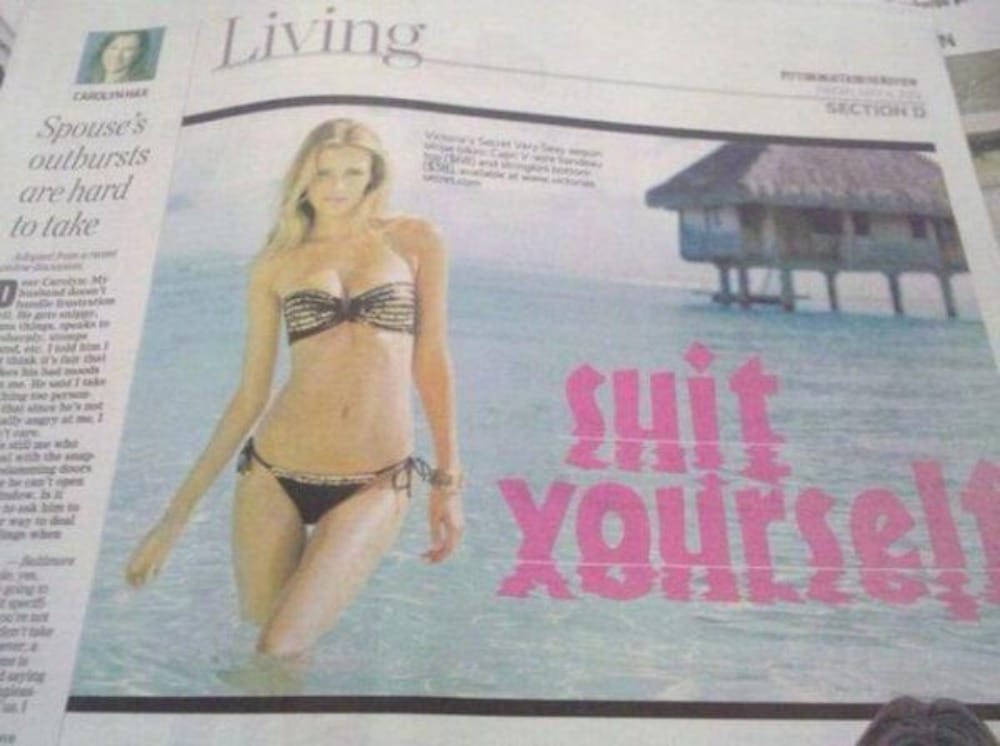
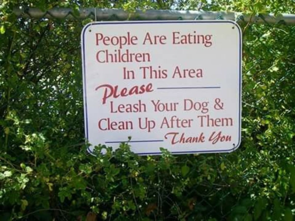
Misjudging Placement
This is one of the best graphic design fails, and it’s even printed on paper. After seeing that, you probably don’t need to be told just how much placement matters in a design. Quite a few graphic design horrors were done on this one.
First, playing with reflections the wrong way ruined the word “suit” there. Second, it’s generally better to go for capital case rather than lowercase. Third, opacity matters just as much as where you place the words, especially when using a reflection. Fourth, we’re back to placement again – is it really optimal to place this alongside the article on the left?
To avoid placement fails, always check your copies or have someone give you their thoughts before printing or publishing them. We understand things like this can happen when you’re in a rush, but taking time to ensure everything is in an optimal place or getting another eye to view your work can save your design.
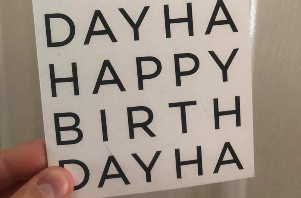
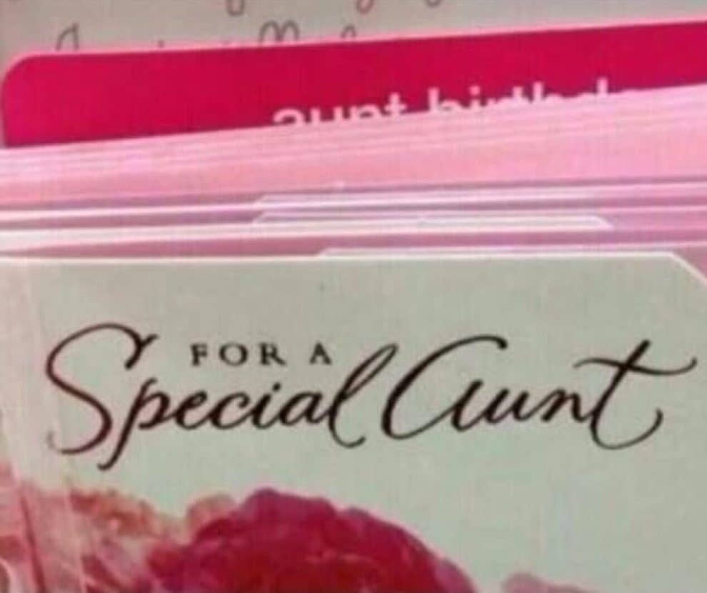
Ruining Hierarchy
Our brains expect to see words in a particular order, and when that doesn’t happen, it can be hard to process whatever information an image is trying to convey. You can avoid graphic design horrors like this by understanding your design’s core message.
What’s the most important thing that your audience needs to know? Place that first, and emphasize it by using a bigger font size. Then, continue by placing the next important idea using a slightly smaller font size, and so on. Don’t forget to mind your placement while doing this!
Elevate Your Brand with Professional Graphic Design Services
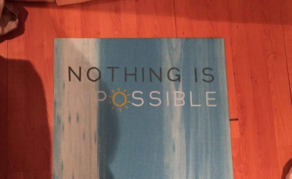
Misapplying Fonts
Remember the “suit” sample earlier? This is not as bad as that, but essentially the same. You can easily avoid this graphic design mistake by sticking to one to three fonts and generally avoiding cursive unless necessary. Additionally, ensure you have a readable font that matches whatever your audience expects from your industry. Remember that in the design world, simple is always better than complicated.
Likewise, always remember to do some kerning. Kerning is where you adjust the spaces between the font because if you don’t, things like this or this could happen. You really don’t want to be remembered as the brand who did that unless it’s part of your marketing strategy.
Misusing Colors
Again, what differentiates a dream design from a nightmare is simplicity over overcrowding. This example isn’t exactly too horrific, but you get the point. If your colors are too close to each other, your audience won’t see or appreciate your design properly. Similarly, if you use clashing colors or colors that don’t complement each other, you won’t get the best out of your design.
To avoid this mistake, stick to a few colors; not too few that you’ll end up with incomprehensible design but not too much that you’ll create a clash of confusing colors. More importantly, create a color palette so you can keep track of the colors you can use.
Not Checking Content
The design itself matters, but even the best design will go to waste if you don’t bother proofreading or checking your content. For instance, if you created something for Italy, check if your content really has Italy-related things. And of course, if your design has words, always read what it says before saying it’s good to publish.
Hiring a Graphic Designer to Avoid Graphic Design Horrors
If these graphic design fails scare you and you think they’re really hard to avoid if you’re not a professional graphic designer, you can always hire VideoBlast to design for you. We have a team of professional graphic designers ready to help you with all your visual content needs.
Elevate Your Brand with Professional Graphic Design Services