A bakery is a special kind of place for people in a community. It’s where you go for a fresh loaf of bread, or a slice of cake. When you have a great bakery, it can be used as a vital hub for community activity because it is a great place to meet friends, share stories, and enjoy food. If you’re thinking about starting your own bakery and need help creating a logo for it, then you’re in the right place. This article will cover 8 bakery logo inspirations to help you create one for your own shop.
8 Bakery Logo Inspirations for Your New Shop
1. Maman
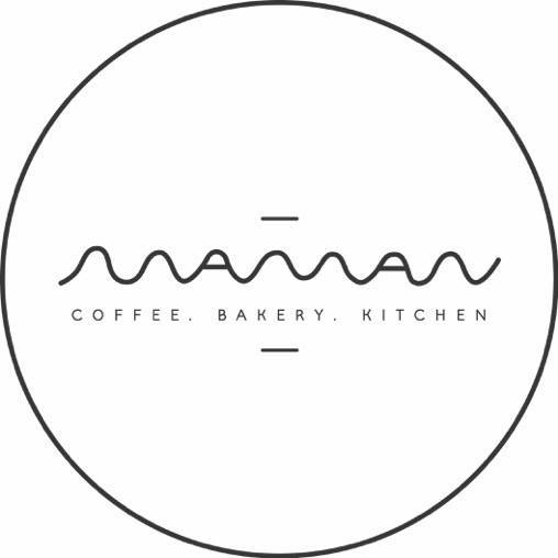
Maman, which is the French word for “mother”, is a French bakery which has cafes across New York, Montreal, and Toronto. They make baked goods, coffee, pastries, and brunch and present it in a home-like atmosphere.
Their bakery has a unique logo which allows them to stand out among other bakeries. The logo is their company name but it is visualised in a creative way where it all flows together. Their fluid logo represents their laid-back approach and ambience while still being a contemporary business.
2. Butler
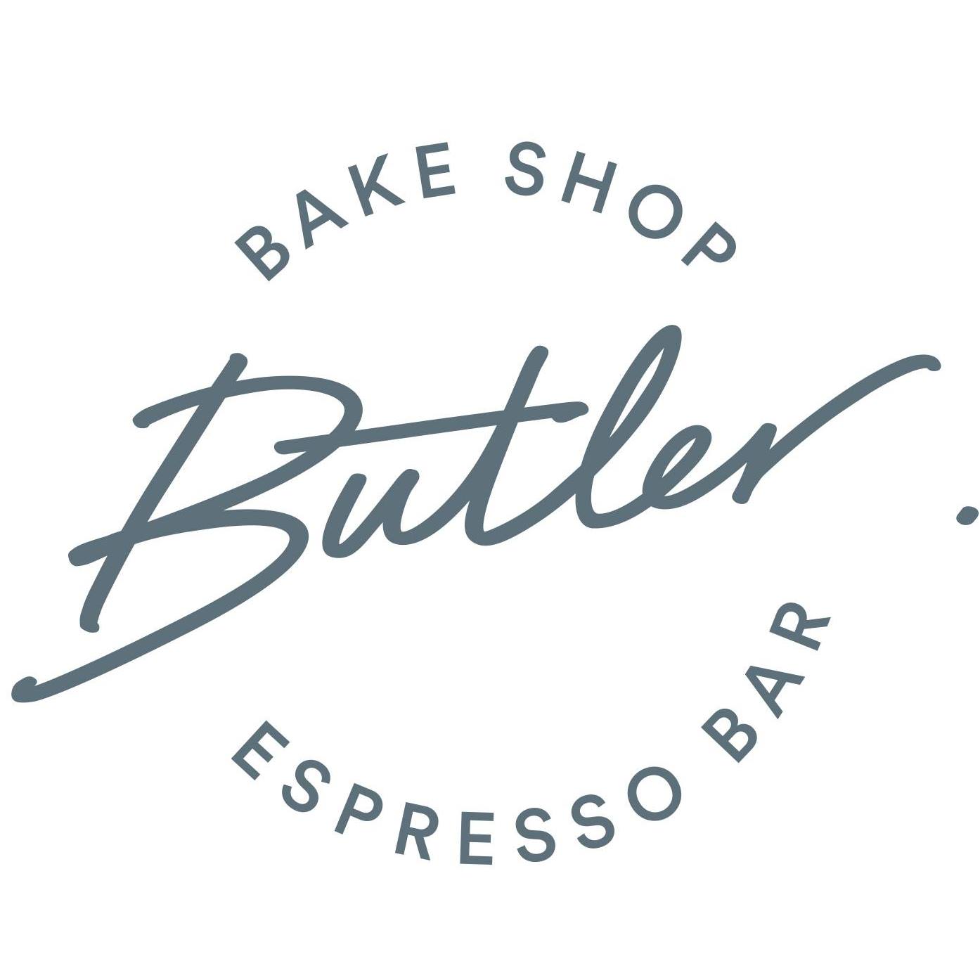
Butler is a New York bakery which has 4 different locations in different parts of the city. They serve baked goods, meals, and also have their own sourced Intelligentsia espresso. Their breakfast pastry experience feels close to fine dining and the logo expresses that too.
While they are mainly a bakery because of their products, their logo gives customers a sense that they offer a lot more besides pastries and baked goods. Using a cursive font shows elegance and sophistication which is great if you want to market yourselves as more than just a bakery.
3. Ovenly
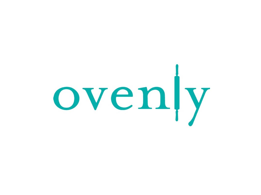
Ovenly is a wholesale and award-winning bakery that is based in New York. They specialise in creating baked goods that strike a balance between sweet and savoury.
They have a simple logo which includes the name of the bakery. What makes this simple logo so creative is that they cleverly placed a rolling pin icon instead of using the letter ‘l’ to emphasise their identity as a bakery.
4. Farine&O
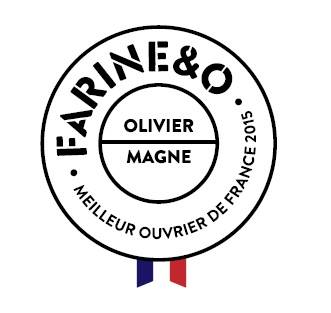
Farine&O is a traditional French bakery that you can find in the middle of Paris. Their bakery name comes from the two simple ingredients needed to make good bread. Farine means flour and ‘O’ refers to eau or water in French.
The logo that they use also does a great job of representing the traditional values that they have for their bakery. They make use of multiple fonts but have one font that stands out among the rest. This helps bring attention to the bakery’s name before reading the rest of the text.
Check out our full list of services
5. Pi Bakerie
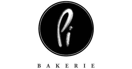
Pi Bakerie is a New York bakery that is focused on fusing Mediterranean Greek flavours with contemporary baking. They use Mediterranean baking traditions that come from Italy and Greece and incorporate them for their own baked goods.
Their logo is simple and reinforces their business name, “Pi” which is the mathematical value of the ratio of a circle’s circumference to its own diameter but also sounds like “pie” which is something that they make a lot in their bakery.
6. The Fat Kid Bakery
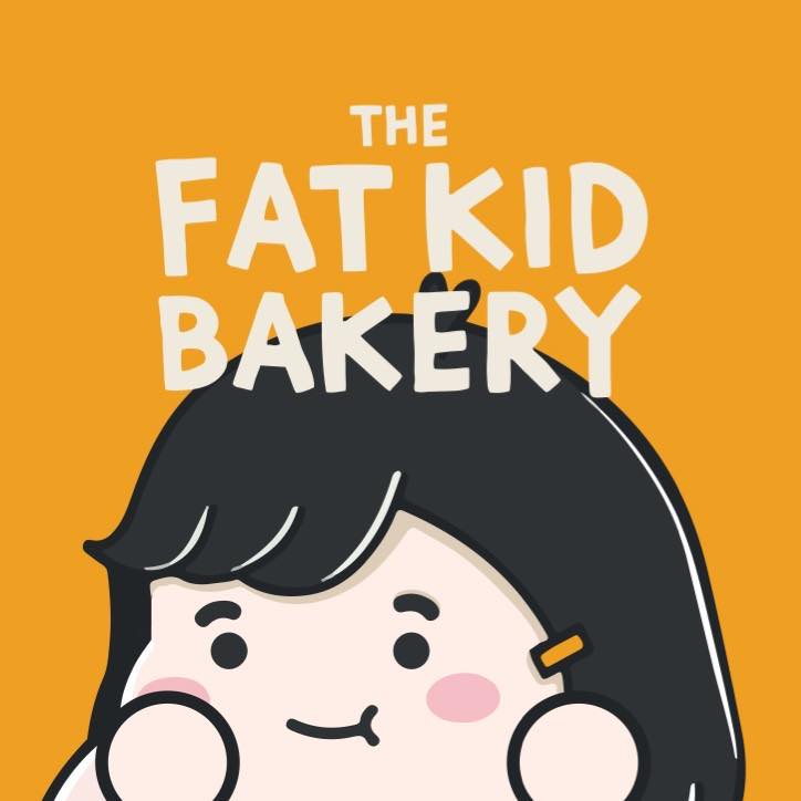
The Fat Kid Bakery is a bakery in Singapore that is best known for their brownies, sourdough bread, croissants, and bombolonis. It was founded in 2020 by a 24 year-old baker and this essence of passion and excitement by their young owner is evident in their logo.
Their logo uses a cute illustrated character as a mascot for the brand. This creative logo allows the bakery to form a sense of connection with their customers. The colours are also great because they are bright and can be easily recognised.
7. Artisan Boulangerie Co.

Artisan Boulangerie Co. is a bakery in Singapore that is owned by award-winning French baker Eran Mayer. He uses flour directly from Chartres, France and high-quality ingredients for their breads and pastries that are baked fresh daily in-house.
What makes their bakery logo so effective is that they just focused on using the initials of their company name since their name may look too long on its own. The logo looks simple and elegant because of the script font and it also looks aesthetically-pleasing with the letters “abc”.
8. Paul
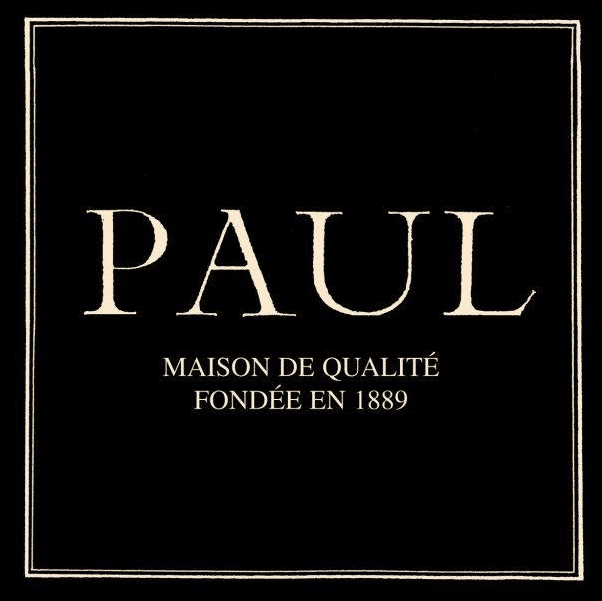
Paul is the largest French chain bakery that has stores in the United States, Singapore, Greece, Poland, the United Kingdom and more. They specialise in serving French products like breads, sandwiches, crepes, macarons, and pastries.
Their bakery logo is simple, clean, and straight to the point. It uses the company name in a formal font and they use a variation of either black or white backgrounds with the font using the contrasting colour. This makes the logo look elegant and stand out.
3 Tips To Make Sure Your Bakery Logo Stands Out
1. Take inspiration but make sure your logo is original
Hopefully, all of those bakery logos mentioned above have inspired you to create your own. However, you should not blatantly copy them and you should only take inspiration with some of the elements that they used in their own logo.
To make sure you create an original logo for your bakery, you will need to be or have someone that is experienced with graphic design so that they can accurately and creatively portray what you want your logo to look like.
2. Add meaning to your logos
The meaning behind your bakery’s logo is important as it will also shape the identity of your company. Without any meaning, it can be difficult for consumers to feel attached or loyal to your bakery especially when there are a lot of other competitors as well.
Logos should have a meaning because this allows you to reach and relate to more customers. To establish a meaningful logo, think about how your products can serve customers in a unique way.
3. Keep things simple
While it is important to create an original and unique logo, you should not overcomplicate the design because this might have a difficult meaning which can confuse audiences or make it hard for them to remember you.
Focus on having a well-thought out logo that is still simple to create and remember. Using too many elements or imagery will make customers lose focus of your logo and its meaning.
If you need any help creating a great logo for your bakery, our team at VideoBlast can help you out. With VideoBlast, you will work with professional graphic designers who have the knowledge and expertise to design creative logos to help your bakery shop stand out.
Our graphic design services allow you to have the best and most creative logos for your business at affordable rates. Our services even include unlimited requests and revisions until you are satisfied with our work.
You can learn all about our graphic design services and other visual design services by contacting us here.